Notes on Digital Color Printing
Last Updated July 8, 2000.
This is now sufficienly out of date that I wouln't consider it to be a
reliable predictor of current results. In general, the quality
and uniformity of digital prints has improved, so perhaps this should
be seen as only of historical interest.
As anyone who has ever
been
in a darkroom will tell you, color is really hard to get
right.
For ordinary purposes, something close to accurate is good enough, and
in
many cases, accuracy isn't really the goal anyway; the goal is to
produce
colors you like.
However, commercial
labs
who are mass producing color prints don't have the luxury, or goal, of
producing
colors especially for your taste; they should be producing as accurate,
constant,
and neutral a rendition of color as possible. This ought to be especially
true of prints from digital originals, since any manipulation of color
can
be done digitally. "Bits is Bits", the results should always be the
same,
at least from the same lab. Any deviation from consistency is
simply
evidence of poor quality control. No other excuses are possible.
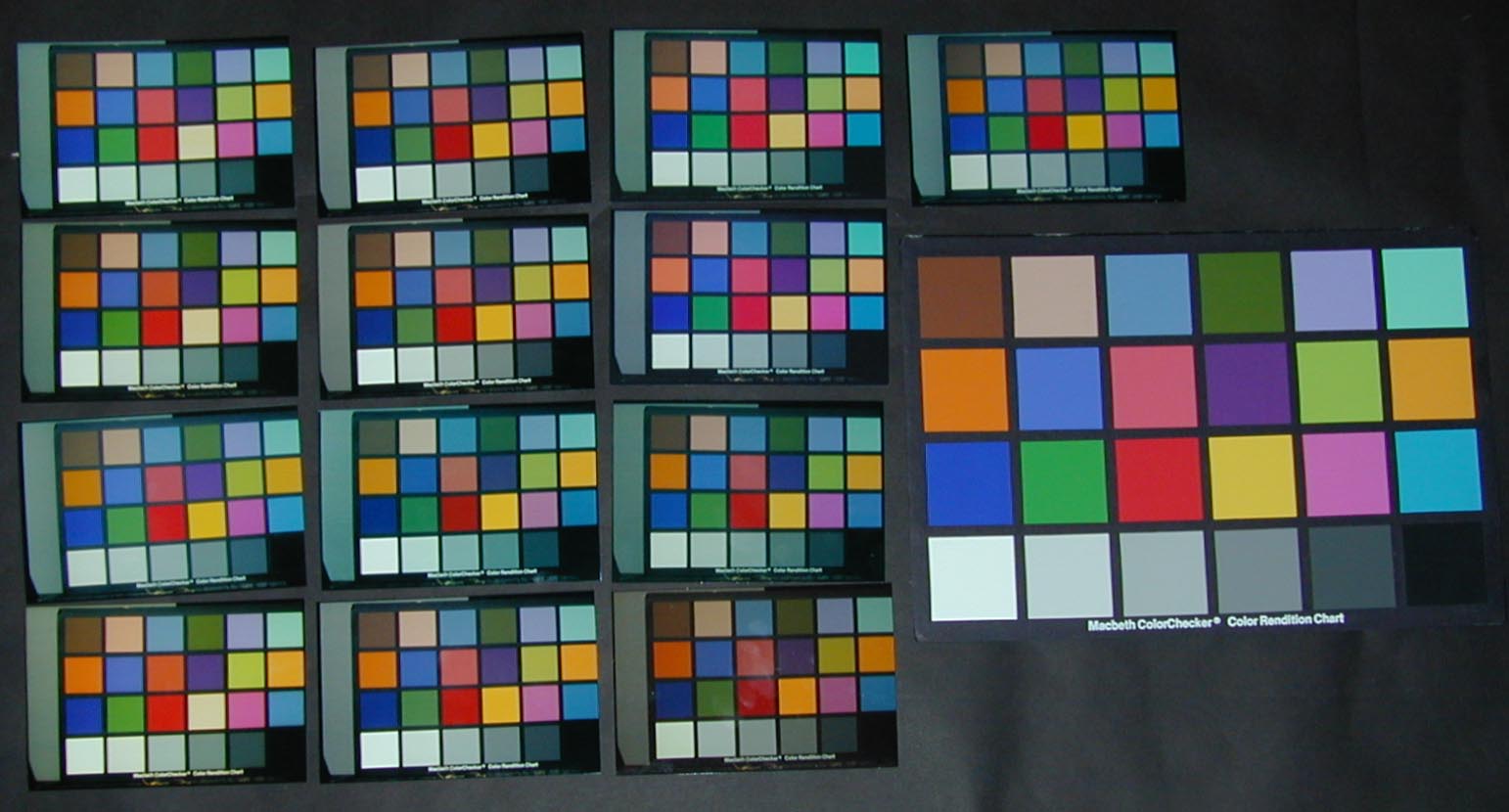
This page features the
Macbeth
Chart image from my test set, which is my main reference for color and
exposure
of "ordinary" images. The full set of images I use to evaluate
prints
can be seen here.
Each of the images in the test challenges the printing process in a
different
way.
With the above in
mind, read
what's below and weep.
 |
This is a single shot, so although the lighting may not be
perfect,
it is consistent. Click on the photo to study the full size
image.
All the 4x6 prints are from the same digital original, so in theory,
all
should look alike, or at least all from the same lab should look
alike.
The
digital
original is from a Kodak PhotoCD scan of a slide, which I judged to be
the
most accurate among many I've taken with various types of film and
lighting.
Note the 50% gray card positioned behind the Macbeth chart in the
composition.
|
|
| Shutterfly |
Ofoto |
PhotoAccess |
PhotoLoft |
| Shutterfly |
Ofoto |
PhotoAccecss |
The original Macbeth Chart |
| PrintRoom |
Ofoto (on a blue day) |
FotoTime |
-- |
| Shutterfly. Note that all three shutterfly prints have
an
extremely weak yellow. |
Ofoto |
Ememories |
-- |
|
Some Tentative Remarks
- Any evaluation of a
service
based on a few samples is extremely problematic. Every one of the
vendors
from whom I have repeated samples is inconsistent, though on the
average,
some are better than others.
- To be fair,
remember
that this is a really tough test; one that ordinarily would not be
done.
At least half of the prints above are part of batches whose color would
be
close enough for everyday use. On the other hand, the rest range
from
marginal to awful. Especially in the digital world, don't let
the
bastards get away with it. Complain and ask for reprints or
credits
until they get it right.
Additional Reading: Matt Dittrich has done similar
research
and reported his results.
Sharing site Smugmug has done
an elaborate comparison
test with a large set of photos and print providers.